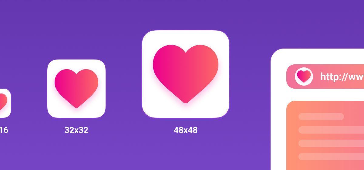
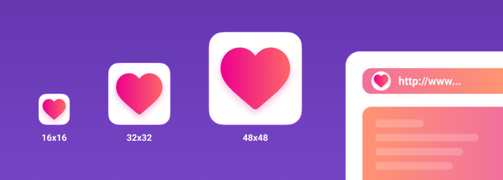
Creating a favicon for the website in 2020
A favicon is a badge (icon) that appears in browser tabs, bookmarks, and snippets of search results.
Favicon plays an important role in web applications. It can improve the appearance of the site in the search results, increase the recognition of your site, help the user to quickly find the desired page in bookmarks and tabs.
In addition, the user can add a page of your site to the phone home screen or save it as a web application. In this case, using favicon, you can quickly find a site among a large number of other applications.
What format to use for favicon?
Previously, ICO was used as the main format. The peculiarity of this format is multi-dimensionality. This file can store several icon sizes. The ICO was replaced by the PNG format. ICO is still supported, but most modern browsers opt for the PNG icon format, which is lighter. Some browsers are unable to select the correct icon in the ICO file, resulting in misuse of the low-resolution icon.
What platforms will this article cover?
- Classic desktop browsers
- Android Chrome
- iOS Safari Web Clip
- Mac OS
- Windows
Classic desktop browsers
Let’s start with the classic desktop.
As mentioned earlier, the ICO format is outdated today, but this does not mean that you need to forget about it. ICO format can save your icon and display favicon correctly in some cases. For example, before IE 11, PNG format is not supported. Therefore, for IE10 and lower versions, you need to use the old ICO format. In this case, it is advisable to use the following combination of ICO and PNG formats:
|
1 2 3 4 5 |
<link type="image/x-icon" rel="shortcut icon" href="…/favicon.ico"> <link type="image/png" sizes="16x16" rel="icon" href="… /favicon-16x16.png"> <link type="image/png" sizes="32x32" rel="icon" href="…/favicon-32x32.png"> <link type="image/png" sizes="96x96" rel="icon" href="…/favicon-96x96.png"> <link type="image/png" sizes="120x120" rel="icon" href="…/favicon-120x120.png"> |
To create a multi-size ICO icon, you can use the icoconvert converter service. When generating an icon, select the following sizes: 16×16, 32×32, 48×48 (highest resolution icon).
PNG icons have the following sizes: 16×16, 32×32, 96×96, 120×120. Why a 120×120 icon? Yandex Help informs that it can use an icon of this size.
If we pay attention to the value of rel (resource type), then an icon is taken into account by most browsers, and a shortcut icon is taken into account by IE browser.
Android Chrome
Android expects to see a 192×192 PNG icon, alpha channel (transparency) is also great here.
Android Chrome relies on the web app manifest. Any site can use the manifest to link to some of the icons.
The manifest file itself is in json format and is declared with the following line:
|
1 |
<link type="image/png" sizes="192x192" rel="icon" href="…/android-icon-192x192.png"> |
Android Chrome relies on the web app manifest. Any site can use the manifest to link to some of the icons.
The manifest file itself is in json format and is declared with the following line:
|
1 |
<link rel="manifest" href="…/manifest.json"> |
The manifest file for Android Chrome can be generated using the RealFaviconGenerator service.
|
1 2 3 4 5 6 7 8 9 10 11 12 13 14 15 16 17 18 19 20 21 22 23 24 25 26 27 28 29 30 31 32 33 34 35 36 37 38 39 40 41 42 |
{ "name": "My Application", "short_name": "App", "description": "Application OK", "lang": "ru-Ru", "start_url": "/", "scope": "/", "display": "standalone", "theme_color": "#ffffff", "background_color": "#ffffff", "icons": [ { "src": "\ / res \ / img \ / icons \ /android-icon-72x72.png", "sizes": "72x72", "type": "image \ / png", "density": "1.5" }, { "src": "\ / res \ / img \ / icons \ / android-icon -96x96.png", "sizes": "96x96", "type": "image \ / png", "density": "2.0" }, { "src": "\ / res \ / img \ / icons \ /android-icon-144x144.png", "sizes": "144x144", "type": "image \ / png", "density": "3.0" }, { "src": "\ / res \ / img \ / icons \ /android-icon-192x192.png", "sizes": "192x192", "type": "image \ / png", "density": "4.0" }, { "src": "\ / res \ / img \ / icons \ /android-icon-512x512.png", "sizes": "512x512", "type": "image \ / png" } ] } |
Icons should have the following sizes: 72×72, 96×96, 144×144, 192×192, 512×512 in PNG format, transparency is encouraged. Since the icon can have a transparent background, you can specify the color in the manifest using background_color.
It is worth canceling that on the phone, the user has the ability to save the browser page to the home screen. It will simply be a link to a page on your site, an icon with the name android-icon-192×192.png will be pulled up, which is declared in your code.
If you connect a manifest to the site, then when opening the page, the user may be prompted to save the site as an application. In this case, you have the opportunity to declare visually the same icon (android-icon-192×192.png) or to redesign the icon for the application to suit your needs and declare it in the manifest with the appropriate dimensions.
iOS Safari Web Clip
iOS Safari expects to see an apple touch icon. This is a 180×180 PNG icon, no alpha channel (no transparency). The corners of the icon will be automatically rounded, making it easier to create an apple touch icon.
IOS users can also add a site to the home screen and it will look like an app. Such a link is displayed as an icon and is called a Web Clip.
The following icon sizes are designed to support various devices such as iPhone and iPad:
|
1 2 3 4 5 6 7 8 9 |
<link sizes="57x57" rel="apple-touch-icon" href="…/apple-touch-icon-57x57.png"> <link sizes="60x60" rel="apple-touch-icon" href="…/apple-touch-icon-60x60.png"> <link sizes="72x72" rel="apple-touch-icon" href="…/apple-touch-icon-72x72.png"> <link sizes="76x76" rel="apple-touch-icon" href="…/apple-touch-icon-76x76.png"> <link sizes="114x114" rel="apple-touch-icon" href="…/apple-touch-icon-114x114.png"> <link sizes="120x120" rel="apple-touch-icon" href="…/apple-touch-icon-120x120.png"> <link sizes="144x144" rel="apple-touch-icon" href="…/apple-touch-icon-144x144.png"> <link sizes="152x152" rel="apple-touch-icon" href="…/apple-touch-icon-152x152.png"> <link sizes="180x180" rel="apple-touch-icon" href="…/apple-touch-icon-180x180.png"> |
In the code, add the rel = “apple-touch-icon” attribute and specify the size.
If the site does not have an icon the size of which is the recommended size for the device, then the closest larger icon will be used. The main apple touch icon is a 180×180 icon. Other devices can mix the icon.
Don’t forget about padding when creating an icon. They must be at least 4px on all sides. This is to prevent your icon from clipping, as the iOS app icon has rounded corners.
It should be noted that iOS devices aren’t the only ones looking for an apple touch icon. Some browsers, such as Android Chrome, may use apple touch icons, as they are more common than other high-resolution PNG icons.
Mac OS
In Mac OS, things are completely different. If the user tries to save the site to the desktop, a screenshot of the page with the html code will be displayed instead of the site icon.
To add an icon, you need to use the SVG format, which will allow you to make an icon mask. This icon will be displayed when you pin a tab in Safari.
|
1 |
<link color="#e52037" rel="mask-icon" href="…/safari-pinned-tab.svg"> |
You need to add rel = “mask-icon” attribute in your code. The SVG icon itself must be black. The color of the icon is set in the color = “# e52037” attribute.
The SVG icon is used in a pinned tab (no focus) in monochrome. On hover (pinned tab – focus), the icon will be painted in the color that has the “color” attribute. The color of the “color” attribute is also passed to the touch bar.
When creating an icon, you need to remove all existing shadows, make it flat and simple. You can simplify an icon to a single object using the operations “Union” and “Flatten”. These operations are easy to apply in Figma.
If you will not make a mask icon, the browser will simply display the first letter of your site’s domain.
Windows
With Windows, it takes a little time to do well.
For IE10 and lower versions, the ICO format must be used as PNG was not supported prior to IE11.
With the arrival of IE11 and Windows 8.1, it became possible to pin sites as live tiles. For small tiles the default favicon is used, and for large and wide tiles you need to set an image of a specific size. This can be done by adding metadata tags to the site markup or by creating a browserconfig.xml (browser configuration file).
An example of adding metadata tags to your website markup for large tiles:
|
1 2 3 4 5 |
<meta name="msapplication-TileImage" content="…/mstile-144x144.png"> <meta name="msapplication-square70x70logo" content="…/mstile-70x70.png"> <meta name="msapplication-square150x150logo" content="…/mstile-150x150.png"> <meta name="msapplication-wide310x150logo" content="…/mstile-310x310.png"> <meta name="msapplication-square310x310logo" content="…/mstile-310x150.png"> |
With this line, we specify the background color of the tile:
|
1 |
<meta name="msapplication-TileColor" content="#2b5797"> |
You can specify the name of your website:
|
1 |
<meta name="application-name" content="My Application"> |
What is browserconfig? It is an XML document listing various icons that correspond to the Metro UI.
To include the browserconfig file in the markup, add the following line to the head:
|
1 |
<meta name="msapplication-config" content="…/browserconfig.xml"> |
The file itself will look like this:
|
1 2 3 4 5 6 7 8 9 10 11 12 |
<?xml version="1.0" encoding="utf-8"?> <browserconfig> <msapplication> <tile> <square70x70logo src="…/mstile-70x70.png"/> <square150x150logo src="…/mstile-150x150.png"/> <square310x310logo src="…/mstile-310x310.png"/> <wide310x150logo src="…/mstile-310x150.png"/> <TileColor>#ffc40d</TileColor> </tile> </msapplication> </browserconfig> |
The browserconfig file defines images for different tile sizes.
Microsoft recommends using larger image sizes in order to support high pixel density screens.
The following list provides some guidelines for using different sizes:
- Small – 70×70 (Recommended size: 128×128)
- Medium – 150×150 (Recommended size: 270×270)
- Wide – 310×150 (Recommended size: 558×270)
- Large – 310×310 (Recommended size: 558×558)
For example, for a 70×70 picture, the recommended size is 128×128. This means that you need to create a 128×128 image with a transparent background, the name of which will be mstile-70×70. Do the same with the rest of the dimensions.
Favicons preparation
Before adding your icons to the root folder of the site, you need to prepare them. The original sizes of the icons are not very large, but they can be compressed with the least loss of quality.
For example, in my case the weight of all images was 200kb, after compression it was 50kb. The quality of the images has barely changed. You can use any convenient image compression service. I used iloveimg.
Conclusion
Connection sequence in the markup of the website:
|
1 2 3 4 5 6 7 8 9 10 11 12 13 14 15 16 17 18 19 20 21 22 23 24 25 26 27 28 29 30 |
<link type="image/x-icon" rel="shortcut icon" href="…/favicon.ico"> <link type="image/png" sizes="16x16" rel="icon" href="… /favicon-16x16.png"> <link type="image/png" sizes="32x32" rel="icon" href="…/favicon-32x32.png"> <link type="image/png" sizes="96x96" rel="icon" href="…/favicon-96x96.png"> <link type="image/png" sizes="120x120" rel="icon" href="…/favicon-120x120.png"> <link type="image/png" sizes="192x192" rel="icon" href="…/android-icon-192x192.png"> <link sizes="57x57" rel="apple-touch-icon" href="…/apple-touch-icon-57x57.png"> <link sizes="60x60" rel="apple-touch-icon" href="…/apple-touch-icon-60x60.png"> <link sizes="72x72" rel="apple-touch-icon" href="…/apple-touch-icon-72x72.png"> <link sizes="76x76" rel="apple-touch-icon" href="…/apple-touch-icon-76x76.png"> <link sizes="114x114" rel="apple-touch-icon" href="…/apple-touch-icon-114x114.png"> <link sizes="120x120" rel="apple-touch-icon" href="…/apple-touch-icon-120x120.png"> <link sizes="144x144" rel="apple-touch-icon" href="…/apple-touch-icon-144x144.png"> <link sizes="152x152" rel="apple-touch-icon" href="…/apple-touch-icon-152x152.png"> <link sizes="180x180" rel="apple-touch-icon" href="…/apple-touch-icon-180x180.png"> <link color="#e52037" rel="mask-icon" href="…/safari-pinned-tab.svg"> <meta name="msapplication-TileColor" content="#2b5797"> <meta name="msapplication-TileImage" content="…/mstile-144x144.png"> <meta name="msapplication-square70x70logo" content="…/mstile-70x70.png"> <meta name="msapplication-square150x150logo" content="…/mstile-150x150.png"> <meta name="msapplication-wide310x150logo" content="…/mstile-310x310.png"> <meta name="msapplication-square310x310logo" content="…/mstile-310x150.png"> <meta name="application-name" content="My Application"> <meta name="msapplication-config" content="…/browserconfig.xml"> <link rel="manifest" href="…/manifest.json"> <meta name="theme-color" content="#ffffff"> |
With the last line of code “theme-color”, you can paint the address bar and notification bar in any color. The content value sets the color.
Use RealFaviconGenerator to check your website icons. This service will show you how your icons are displayed on different platforms, tell you where and what problems there may be.
In addition, this service can generate the required sizes, icon formats and code. But it is necessary to check the source code for the presence of all the recommended sizes for correct display on various devices.