
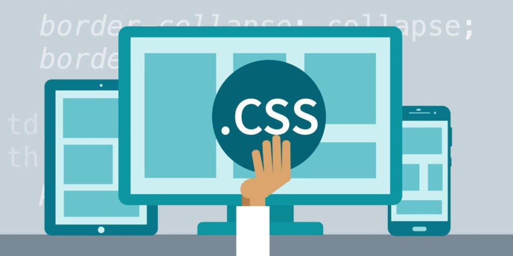
List of the best CSS frameworks for front-end development
Do you
dream of quickly prototyping applications? Simplify your task with these CSS
frameworks. And do not have to worry about the styles.
Here is a
list of the best CSS frameworks for front-end development.
Why use CSS
frameworks when writing custom CSS? Time is a limited resource, so spend it on
creating functionality. Improve performance and aesthetics when creating CSS
from scratch? Absolutely! CSS may be more effective in conveying this work to a
professional.
Or use a
cool framework to create a client interface. Here is a complete list of the
most famous and used CSS frameworks.
Ant Design
Purpose: “Ant Design simplifies design and facilitates the creation of prototypes for all project participants. The highest efficiency in developing background applications and products. ” – Ant Design webpage.
Here is a
list of the best CSS frameworks for front-end development.
Ant Design Illustration
Ant Design,
a design language for background applications, is being developed by the Ant
UED team. User interfaces for internal background projects, usually spent on
design and external development.
Features
- Enterprise-class user interface development
language for web applications. - A set of high quality React components out of
the box. - It is written in TypeScript with ready-made
type variants. - A complete package of resources and tools for
development and design.
Environment
support
- Modern browsers and Internet Explorer 9+ (with
polyfills). - Server side rendering.
- Electron.
Foundation
Purpose: “Foundation is a family of advanced adaptive
front-end frameworks. Accelerates the transition from prototyping to
production. The framework includes a fully customizable responsive grid, the
large Sass library includes frequently used JavaScript plugins, and full
accessibility support. ” – from the Foundation webpage.
Features
- Supports web accessibility.
- Designed for simplicity.
- Flexible Sass.
- ZURB starter templates.
Bulma
Purpose:
Bulma – CSS framework. CSS: bulma.css.
JavaScript
is not included here. People tend to use their own JS implementation (and have
already written one). Bulma does not depend on the environment: it is a layer
of the style of surfaces above logic.
Features
- Using the latest CSS3 features like Flexbox,
CSS and CSS Grid made Bulma is cutting-edge search technology. - Simple grid system: to create a Bulma grid, you
need only one .columns container - Easy to learn syntax: with simplest readable
class names (e.g. .button or .title) and friendly modifiers (e.g. .is-primary
or .is-large) it’s easy to get to know Bulma in a matter of minutes. - 100+ useful CSS helpers.
- Much more.
Specter.css
According
to the website, Specter.css is “an easy, responsive, and modern CSS framework
for accelerated and extensible development.” Specter provides basic styles for
design fonts and elements, a responsive Flexbox-based layout system, and clean
CSS components and utilities. ”
Features
- Lightweight (~ 10KB compressed).
- Aesthetically pleasing components and color
palette. - Intuitive syntax.
- Flexibility: JS is not required.
CSS tailwind
Purpose:
“Tailwind CSS is a finely tuned, low-level CSS framework that provides all the
necessary building blocks for – from the Tailwind CSS web page.
Features
- Responsive.
- Expandable by components.
- Customizable.
shoelaces
Purpose:
“Shoelace.css is a lightweight, progressive CSS library created using the
syntax of future CSS. Easy to use and customizable. The bootstrap of this
library is not yet familiar, but refreshing. You can use shoelaces with almost
any browser. The CDN version is great for prototyping, but in order to take
full advantage of the source code. ” – from the Shoelaces web page.
Features
- Lightweight ~ 69KB.
- Uses native CSS variables and functions of the
future CSS. - Easy to use and customizable.
Semantic ui
Purpose:
“Semantic UI treats words and classes as interchangeable concepts. Classes use
syntax from natural languages: noun-definition, word order, and plurality to
intuitively relate concepts. Get the same benefits as BEM or SMACSS, but
without fatigue. ” – from the Semantic UI webpage.
Features
- Concise HTML with interchangeable words and
classes.
<div
class = “ui three buttons”>
<button
class = “ui active button”> One </button>
<button
class = “ui button”> Two </button>
<button
class = “ui button”> Three </button>
</div>
- Simplified debugging.
- Thematic design.
Skeleton
Purpose:
“Skeleton style only part of the standard HTML elements and includes a grid,
but this is often enough to get started. Use Skeleton if you are starting a
smaller project or just feel that you don’t need all the usefulness of larger
CSS frameworks. ” – from the Skeleton web page.
Features
- Light as a feather ~ 400 lines.
- Designed for mobile devices.
- Designed styles are the starting point, not the
basis of the user interface. - Quick start, without the need for compilation
or installation. - You will love Skeleton for speeding up
development and ease of setup.
Tachyons
Purpose:
“Tachyons is a design system for functional CSS and people. Quickly create and
design a new user interface without writing CSS. ” – from the GitHub Tachyons
page.
Tachyons
“Design
systems break down when scaling (either organization or product) because new
components or component variants are being introduced. Such modifications
sometimes – read: often – remain undocumented, which leads to duplication when
this component or variant is needed (and created) again. Even when a component
is documented, the effectiveness of this procedure often means tens or hundreds
of instances to describe all states or options. Systems like Tachyons and the
like have a different approach to the problem: instead, they document and
restrict the * properties * of the components. (It’s nice to think of it as a
“subatomic” design.)
Then you
create components by composing subatomic components (properties). Instead of
implementing the component and its variants, you get a complete list of
subatomic components of the “ingredient”. These subatomic components combine in
thousands of ways to create hundreds of components. The properties of these
components are numerous, but are limited by the set of acceptable values (our
subatomic components). ” – Daniel Eden, a Facebook designer.
Features
- CSS architecture for mobile devices.
- 490 color combinations available.
- Numerous debugging utilities to reduce layout
complexity. - Lightweight (~ 14KB).
- An open source component library.
- Suitable for working with ordinary HTML, React,
Ember, Angular, Rails and others. - Adaptive grid system with infinite nesting.
- Created using PostCSS.
Material design
Purpose:
“Created and designed by Google, Material Design is a design system that
combines the classic principles of effective design with innovation and
technology. Google’s goal is to develop a design system that provides a
consistent user experience with all products on any platform. ” – from the
Material Design web page.
Features
- Widely supported.
- Starting templates.
- Third Party Support.
Want to add
something to this list of CSS frameworks? Let us know!
